Page 1 of 3
Style suggestion / help needed
Posted: Sun Apr 24, 2016 4:22 pm
by Valerion
Hi all,
I won't be able to directly re-apply the old style to the new forum format. However, I still have all the files for the old style.
We can select a new style going forward and mod it as we need, or if someone is brave we can create our own, even. Please make sure it works on phpBB 3.1(.9) though first, please.
https://www.phpbb.com/customise/db/styl ... les-12/3.1 - Official 3.1 style list
https://www.phpbb.com/styles/ - information on how to create our own.
Re: Style suggestion / help needed
Posted: Sun Apr 24, 2016 4:26 pm
by Rakuen Growlithe
And I'm going to sit in a corner and sulk about it. And veto any really ugly themes. >.>
Re: Style suggestion / help needed
Posted: Sun Apr 24, 2016 4:37 pm
by Valerion
The old style was Black Pearl - available here:
https://www.phpbb.com/customise/db/style/black_pearl/
Unfortunately it's not updated for 3.1. The support forum has a few update requests for it.
Re: Style suggestion / help needed
Posted: Sun Apr 24, 2016 4:38 pm
by Rakuen Growlithe
These seem to be the best to me.
Black is least offensive to the eyes and fairly similar to the old style, though it has blue theme. I like blue so that's fine.
https://www.phpbb.com/customise/db/style/black/
AnimeZone is even more similar to the old style in terms of colour but we will have to remove that anime banner but I could see it working.
https://www.phpbb.com/customise/db/style/animezone/
CA Black got mentioned a bit on IRC and it looks like the old style only the screenshot is tiny so it's a bit of a gamble.
https://www.phpbb.com/customise/db/style/ca_black/
Of course I'm not sure what the possibility is of having a number of possible themes and allowing users to select one of their own choosing. I'm guessing it doesn't work though.
Re: Style suggestion / help needed
Posted: Sun Apr 24, 2016 4:42 pm
by Valerion
It is definitely supported to have multiple styles installed and making it user-selectable
Re: Style suggestion / help needed
Posted: Sun Apr 24, 2016 4:55 pm
by Raven Song
I like both the dark ones. I also, as a smart human, cant see much difference between them

Re: Style suggestion / help needed
Posted: Sun Apr 24, 2016 5:13 pm
by Contrast
I'm with Rakuen. Black is definitely the easiest on the eyes. In addition to that, I'd like to make two more light suggestions.
Since we read from left to right, it makes no sense for the avatars to be on the right. I like to see who posted something before I read what they actually wrote, instead of the other way around. It saves a lot of eyeball energy not having to double back each time.
Also, I really hate having to click twice in order to get to "new posts". I really liked having it available from the get-go. It saves a lot of vital finger energy.
But that's just my two cents.
Re: Style suggestion / help needed
Posted: Sun Apr 24, 2016 5:30 pm
by Franky
True about the black but it looks kinda unprofessional in a work environment. I like retroish themes with little to no depth on buttons etc.. but that is me
Edit:
I like
this cause my manager will think it's visual studio. XD
Damn 3.0
Re: Style suggestion / help needed
Posted: Sun Apr 24, 2016 5:52 pm
by Linea
Contrast wrote:Since we read from left to right, it makes no sense for the avatars to be on the right. (snip)
Also, I really hate having to click twice in order to get to "new posts".
Second both these points, and the black theme suggestion as well.
Is the user-selectable feature technically viable?
Re: Style suggestion / help needed
Posted: Sun Apr 24, 2016 6:19 pm
by Rakuen Growlithe
Valerion says yes but since he lost his whole weekend to fixing forum issues I would wait a bit before asking for individual themes because you think they're pretty.
Re: Style suggestion / help needed
Posted: Sun Apr 24, 2016 6:21 pm
by Contrast
There's one more thing kind of getting on my nerves. I don't like having to scroll all the way back to the top after I finish reading a thread in order to get back to "new posts". So much fingering finger energy going to waste! >.<
If the eventual style we settle on could be like the old one, where we had a "new posts" at the top and bottom, I'm sure everyone would be most appreciative.
Re: Style suggestion / help needed
Posted: Sun Apr 24, 2016 6:22 pm
by Rakuen Growlithe
Contrast wrote:There's one more thing kind of getting on my nerves. I don't like having to scroll all the way back to the top after I finish reading a thread in order to get back to "new posts". So much fingering finger energy going to waste! >.<
Explain in more detail because I think both your complaints were you not doing it right...
Re: Style suggestion / help needed
Posted: Sun Apr 24, 2016 6:27 pm
by Contrast
Rakuen Growlithe wrote:Explain in more detail because I think both your complaints were you not doing it right...
In the old style, you could simply click "new posts" and it would take you to the new posts. That's just one click. Plus, there was a button for "new posts" at the top and at the bottom of each thread.
But now you have to click on "Quick links" first to get to "new posts". That's twice the amount of clicking. And it can only be found at the top of the thread. That makes for extra seconds of scrolling. It's not very efficient.
Re: Style suggestion / help needed
Posted: Sun Apr 24, 2016 6:29 pm
by WolfyDragon
:>
Re: Style suggestion / help needed
Posted: Sun Apr 24, 2016 6:32 pm
by Rakuen Growlithe
Contrast wrote:In the old style, you could simply click "new posts" and it would take you to the new posts. That's just one click. Plus, there was a button for "new posts" at the top and at the bottom of each thread.
But now you have to click on "Quick links" first to get to "new posts". That's twice the amount of clicking. And it can only be found at the top of the thread. That makes for extra seconds of scrolling. It's not very efficient.
Ah, now I understand. I never used that feature but I think that was thanks to our beloved forum's old style. If it helps, you can just click the HOME button on your keyboard to go to the top of the page. That should solve half the problem.
Re: Style suggestion / help needed
Posted: Sun Apr 24, 2016 6:42 pm
by Sev
Since flat themes are all the rage these days, I really like how
Digi looks.
Re: Style suggestion / help needed
Posted: Sun Apr 24, 2016 6:44 pm
by Rakuen Growlithe
Was suggested on IRC but Black has better contrast between sections and between headers and sections. With Digi, everything blurs together.
Re: Style suggestion / help needed
Posted: Sun Apr 24, 2016 7:00 pm
by Sev
I suppose, but glossy, raised UI's are also falling out of favor these days. The two standards right now are Metro and Material, and they are both flat.
I think that we should let the ideas pool for a while. The admins can then create a short list from those, which are then voted on using a poll.
Re: Style suggestion / help needed
Posted: Sun Apr 24, 2016 7:20 pm
by Ryall
This forum is dead to me!

(in it's current state)
Thanks for all your hard work Val.
The AnimeZone one looks quite nice.
EDIT: Oh sh**t! I just realised everyone can see all my black text, ever! No!

Re: Style suggestion / help needed
Posted: Sun Apr 24, 2016 7:22 pm
by Leeward
WolfyDragon wrote::>
Who are you, person who last posted 6 years ago?
Re: Style suggestion / help needed
Posted: Sun Apr 24, 2016 7:37 pm
by Adagio
Ryall wrote:This forum is dead to me!
(in it's current state)
Thanks for all your hard work Val.
The AnimeZone one looks quite nice.
EDIT: Oh sh**t! I just realised everyone can see all my black text, ever! No!
HAHAHAHAHAHAHA!!! Ooooooh boy!
Re: Style suggestion / help needed
Posted: Sun Apr 24, 2016 8:08 pm
by Raven Song
Leeward wrote:WolfyDragon wrote::>
Who are you, person who last posted 6 years ago?
THATS WHAT I THOUGHT!!!!!!!!!!
Re: Style suggestion / help needed
Posted: Sun Apr 24, 2016 8:36 pm
by Fluke
Put the avatars and such on the left-hand-side please.
A very light-grey theme with black text would be perfect. I really dislike the white-text on black.
 http://uxmovement.com/content/when-to-u ... ackground/
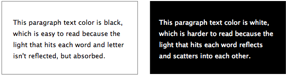
First up is this quote from a paper titled “Improving the legibility of visual display units through contrast reversal”. In present time we think of contrast reversal meaning black-on-white, but remember this paper is from 1980 when VDUs (monitors) where green-on-black. This paper formed part of the research that drove the push for this to change to the screen formats we use today.
However, most studies have shown that dark characters on a light background are superior to light characters on a dark background (when the refresh rate is fairly high). For example, Bauer and Cavonius (1980) found that participants were 26% more accurate in reading text when they read it with dark characters on a light background.
Reference: Bauer, D., & Cavonius, C., R. (1980). Improving the legibility of visual display units through contrast reversal. In E. Grandjean, E. Vigliani (Eds.), Ergonomic Aspects of Visual Display Terminals (pp. 137-142). London: Taylor & Francis
Ok, 26% improvement – but why?
People with astigmatism (aproximately 50% of the population) find it harder to read white text on black than black text on white. Part of this has to do with light levels: with a bright display (white background) the iris closes a bit more, decreasing the effect of the “deformed” lens; with a dark display (black background) the iris opens to receive more light and the deformation of the lens creates a much fuzzier focus at the eye.
Jason Harrison – Post Doctoral Fellow, Imager Lab Manager – Sensory Perception and Interaction Research Group, University of British Columbia
The “fuzzing” effect that Jason refers to is known as halation.
It might feel strange pushing your primary design goals based on the vision impaired, but when 50% of the population of have this “impairment” it’s actually closer to being the norm than an impairment.
The web is rife with research on the topic, but I think these two quotes provide a succinct justification for why light text on a dark background is a bad idea.
https://blog.tatham.oddie.com.au/2008/1 ... -bad-idea/
I am fine with even keeping the default color-scheme, moving the avatars and such to the left-hand-side and customizing the icons + header.
Also, let us change our own user titles while we're at it. "Tyrant's Eye" is something I don't want, but don't want to bother asking the admins to change it.
Re: Style suggestion / help needed
Posted: Sun Apr 24, 2016 8:47 pm
by Sev
But don't dark backgrounds also cause less eyestrain?
Re: Style suggestion / help needed
Posted: Sun Apr 24, 2016 8:48 pm
by Rakuen Growlithe
Yeah, I'd say we're going for dark default. Maybe there'll be a lighter alternative for people.
Re: Style suggestion / help needed
Posted: Sun Apr 24, 2016 8:57 pm
by Fluke
Sev wrote:But don't dark backgrounds also cause less eyestrain?
People with astigmatism (aproximately 50% of the population) find it harder to read white text on black than black text on white. Part of this has to do with light levels: with a bright display (white background) the iris closes a bit more, decreasing the effect of the “deformed” lens; with a dark display (black background) the iris opens to receive more light and the deformation of the lens creates a much fuzzier focus at the eye.
Re: Style suggestion / help needed
Posted: Sun Apr 24, 2016 10:39 pm
by Valerion
I have installed some styles from this thread, and unlocked the global style lock, so you can select a new style in your UCP now. I sorta like Digi. One of the styles I installed was AnimeZone. And ... no. Just ... no. That one will not survive the upcoming Style Purge.
We can then later on make a decision on the way forward.
1) We select a style and enforce it board-wide
2) Someone creates a custom style for us, and we use that board-wide
3) We leave styles user-selectable
Styles in 3.1 can inherit from others, so making minor mods to an existing style might be easy.
Re: Style suggestion / help needed
Posted: Sun Apr 24, 2016 11:10 pm
by Leeward
Awesome, thanks! I quite like Black (Green).
Re: Style suggestion / help needed
Posted: Sun Apr 24, 2016 11:35 pm
by Sev
I quite like the two dark variations of Digi.
Re: Style suggestion / help needed
Posted: Mon Apr 25, 2016 7:27 am
by Adagio
Valerion wrote:AnimeZone. And ... no. Just ... no. That one will not survive the upcoming Style Purge.
Why not?
So far it's the closest to the old one...
I like it...
Apart from the anime in the banner... Haha!